Probably the most important nice-to-have feature of any application.
TL;DR
This is actually the first time I "developed" a light/dark theme feature.
Thanks to the daisyUI component library it was not as difficult as I initially expected.
Added theme widget that changes data-theme attribute on <html> element between light and dark mode.
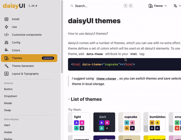
One of the reasons I chose daisyUI was because of the wide range of preset themes and the ease of the setup. I am not a fan of setting up colors and design by myself. Whenever possible, use things provided by geniuses who created the library.
I went for 2 themes that have similar primary color (main color)
- light theme:
bumblebee - dark theme:
halloween
To setup application theme:
set tailwind.config.js to load only necessary themes.
module.exports = {
  content: ['./src/**/*.{js,ts,jsx,tsx}'],
  plugins: [require('daisyui')],
  daisyui: {
    themes: ['bumblebee', 'halloween'],
  },
};
and set the data-theme property on the html element to either one of them as the initial theme.
<!-- index.html -->
<html lang="en" data-theme="bumblebee">
Switching themes is only about changing that data-theme attribute on html element.
Theme widget code below.
Swap component with icons comes from daisyUI - swap component
import { Component, createEffect, createSignal, onMount } from 'solid-js';

export enum Theme {
  LIGHT = 'bumblebee',
  DARK = 'halloween',
}

export const ThemeWidget: Component = () => {
  let htmlRef: HTMLElement | null = null;

  const [theme, setTheme] = createSignal(Theme.LIGHT);

  onMount(() => {
    htmlRef = document.querySelector('html');
  });

  createEffect(() => {
    if (htmlRef) {
      htmlRef.dataset.theme = theme();
    }
  });

  const toggleTheme = () => {
    setTheme(theme() === Theme.LIGHT ? Theme.DARK : Theme.LIGHT);
  };

  return (
    <div class='absolute top-4 right-6'>
      <label
        class={`swap swap-rotate ${theme() === Theme.DARK && 'swap-active'}`}
        onClick={toggleTheme}
      >
        {/* sun icon */}
        <svg>{...}</svg>

        {/* moon icon */}
        <svg>{...}</svg>
      </label>
    </div>
  );
};
Make the theme show different colors
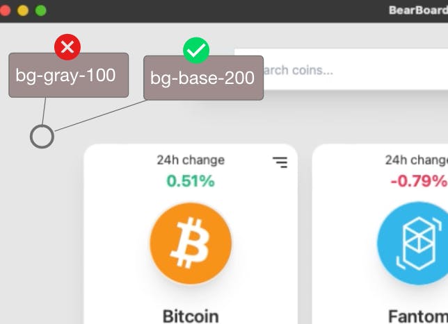
When I started working on the application, I didn't really use theme-specific colors but fixed tailwind color classes instead. For example, initially, when switching between themes, the main background color was still the same shade of gray.
I had the page background color set to bg-gray-100. So obviously, changing between dark/light themes would always keep the background gray. And I should have used one of the theme-specific colors defined in daisyUI instead. In this case one of bg-base colors like bg-base-200 because they change depending on the selected theme.